<-
Return Home


How I Turned a Broken Phone Into 7 Key Fixes for Hevy on Apple Watch

How a small accident showed simple ways to make an app work better for workouts on a watch.
My phone broke at the gym last week.
I was setting up for a heavy deadlift, and it just slipped out of my pocket.
Screen shattered. Completely unusable.
At first, I thought, “Well, great. Guess I’ll just sit at home until insurance comes through.” But workouts are non-negotiable for me, so I had to figure something out.
That’s when my Apple Watch went from being a fancy step counter to my full-on gym companion. I had no choice.
I downloaded all my music onto it, paired my headphones, and then remembered, wait, doesn’t Hevy have a watch app?
Perfect. No phone? No problem. I could log workouts and stay on track all from my wrist.
At least, that was the plan.
The first day or two was manageable, but it didn’t take long to notice cracks in the system.
There were little moments where I thought, “This could’ve been smoother.” Like having to dig around for basic info mid-set.
Or struggling to scroll precisely on those tiny screens with sweaty fingers. Or missing key workout stats on the one screen where they’d actually be useful.
And don’t even get me started on how resting between sets becomes a guessing game without proper alerts or an intuitive standby screen.
It’s like the app just wasn’t designed for someone relying entirely on the watch.
Don’t get me wrong, I appreciate the app.
It’s functional, and it kept me going while my phone was out of commission.
But I couldn’t help but think about how a few smart changes could take it from “good enough” to amazing.
That’s why I decided to write this!
I want to talk about the gaps I noticed using Hevy on the Apple Watch and offer some practical, simple design fixes. If Hevy ever reads this, maybe they’ll use these ideas to improve the app.
And if not? Well, maybe their competitors will.
Either way, here’s how it could be better.
A sneak peek at the result.
What was wrong? How & Why changing it?
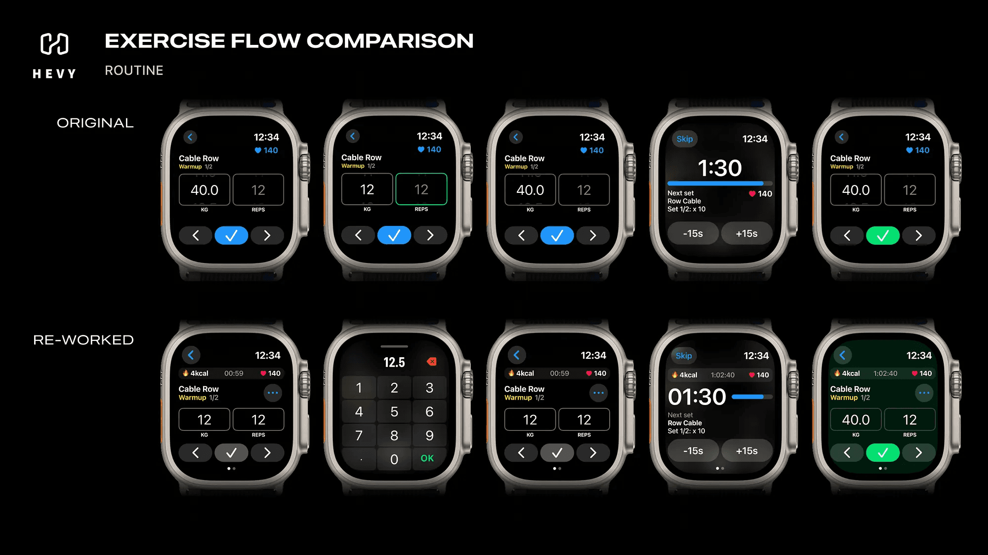
The Routine View
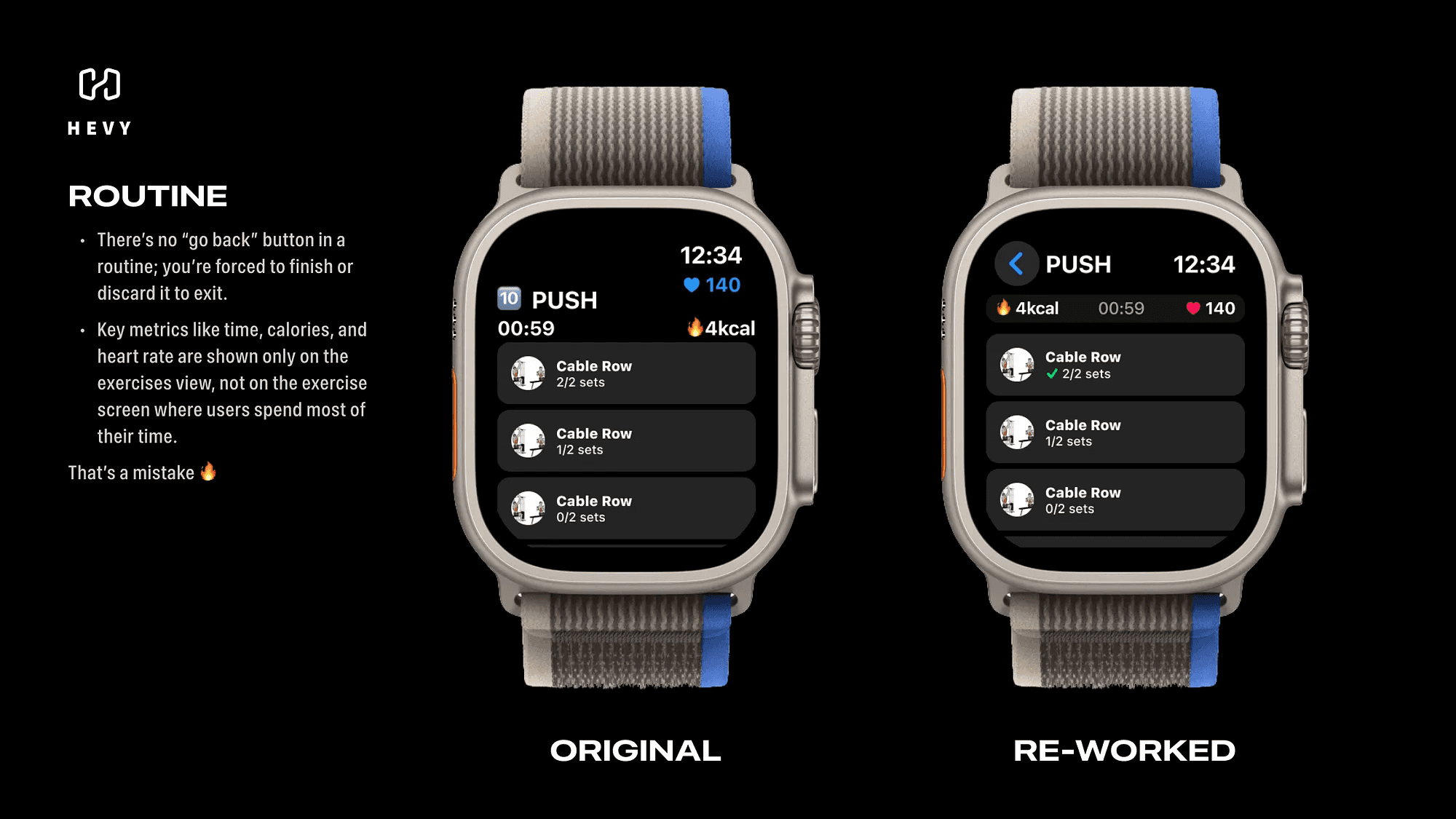
This was the first pain point I ran into.
Once you start a routine, you’re stuck there. No way to go back.
You’re forced to either finish the routine or discard it entirely if you want to navigate back to the previous screen.
It felt unnecessarily rigid. Sometimes I’d accidentally start a routine or realize I needed to adjust something before diving in, and the app just wouldn’t let me.
Another issue? When you’re in the routine, the app shows important stats like time elapsed, calories burned, and heart rate, on one screen.
But the moment you move to the exercise screen, where you spend 80% of the workout, those stats disappear.
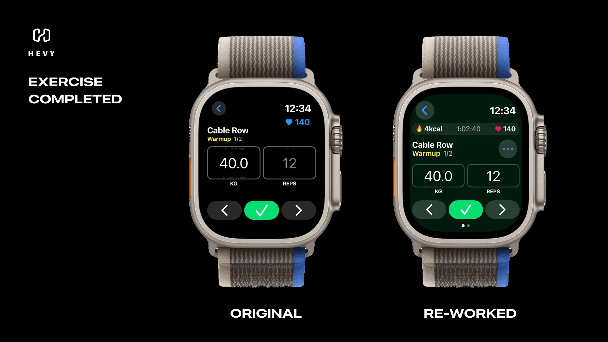
Then there’s the logging feedback, or lack of it.
When you fully log an exercise, it looks almost identical to an unfinished one.
And if you skip logging a set? Same story. There’s just a small, bland written counter in white, easy to miss in the middle of a workout.
Here’s what I’d suggest:
Add a back button labeled with the routine name, so users can exit gracefully without discarding progress.
Group the core metrics (time, calories, heart rate) into a persistent info bar visible on every screen.
Use a more visual indicator, like a green check mark or a highlighted box, to show fully logged exercises. For incomplete ones, a red or yellow flag could remind you to review before finishing the routine.
These tweaks would make the flow way smoother and less frustrating.
The Exercise View
This is where you spend most of your time during a workout, but the experience feels clunky.
First, the weight and reps selectors are way too sensitive.
Scrolling one step is like trying to thread a needle while holding a dumbbell. You need surgical precision, which just isn’t realistic during a workout.
Second, the main button to log a set uses blue to indicate it’s inactive and green for active.
But here’s the problem: those two colors are being used interchangeably as primary indicators throughout the app. It makes it harder to tell what’s happening at a glance.
There’s also an odd little quirk, if you scroll down on the exercise screen, you’ll find more options for the set or exercise, but they’re hidden.
You wouldn’t even know they’re there unless you accidentally scrolled far enough.
Fixing this is simple:
Make the selectors less sensitive for smaller adjustments and allow users to tap for direct input when jumping between bigger numbers.
Change the log button to gray when inactive. Keep it green for active but adjust the background color for extra clarity.
Add a “More” button to reveal additional options instead of hiding them behind scrolling.
Bonus idea? Let users swipe right to quickly access media controls for Apple Music or Spotify.
Managing music mid-workout would feel seamless.
The Timer View
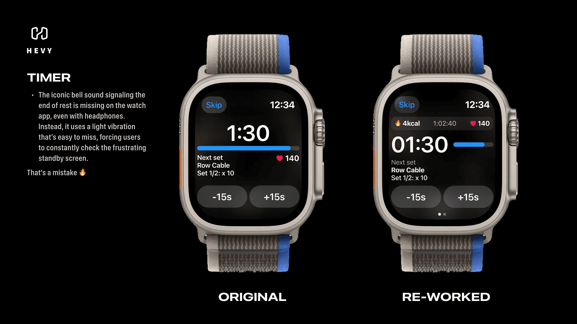
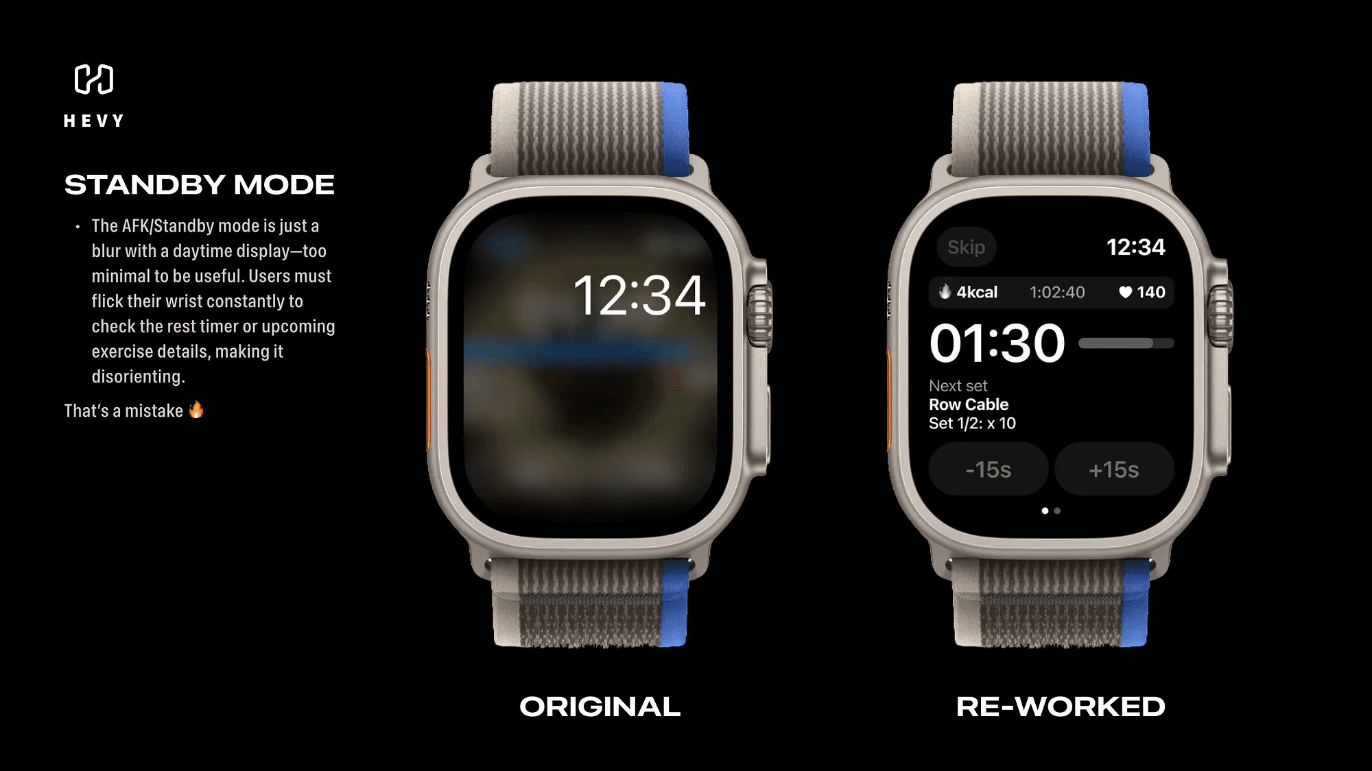
The timer screen is functional, but it’s not gym-friendly.
When the watch goes into standby during rest periods, the screen turns into a blurred mess, with only the time of day visible.
If you want to check how much time is left or see what’s coming up, you haveto flick your wrist, wake the screen, and squint at the info.
On top of that, the app doesn’t play Hevy’s signature bell sound when rest is over.
You’re stuck relying on a light vibration, which is way too easy to miss, especially with headphones on.
Here’s how this could be improved:
Redesign the standby screen to keep key info like remaining rest time and the next exercise visible. Use a black-and-white design to save battery for AMOLED screens.
Add Hevy’s iconic bell sound as an audio cue, either through the watch’s speaker or connected headphones.
These small changes would save so much hassle and make rest periods less of a guessing game.
Final Thoughts
Using Hevy on the Apple Watch isn’t bad, but it could be great.
Fixing the rigid navigation, improving the flow of information, and rethinking how users interact with the app during a workout would take the experience to the next level.
When your phone is out of reach, your watch becomes your lifeline.
And the better the apps are designed, the easier it is to keep pushing toward your fitness goals, even when life throws you a curveball.
